
New look Bible Cartoons logo & page logos
Posted 29 Jul 2016
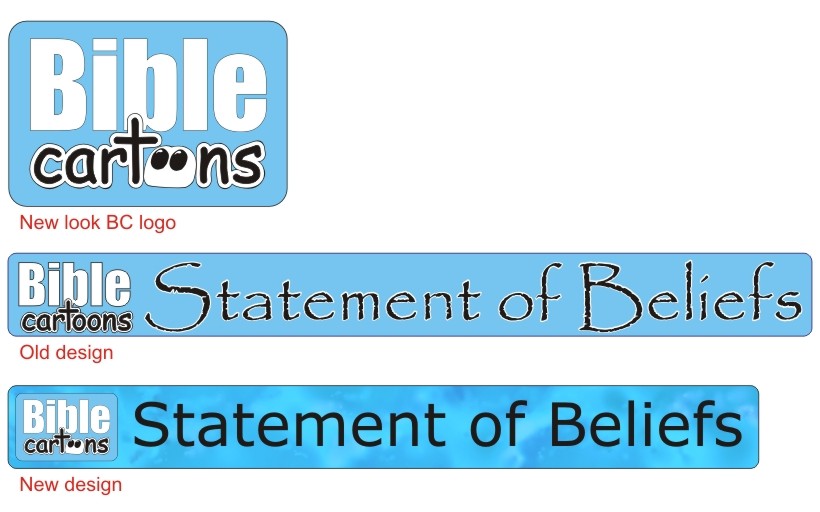
BC Logo – old and new
I thought it was about time to re-vamp the Bible Cartoons logo, especially as I have been altering a lot of other things on the BC website!
If you look at the image above you will see I have made the double “o” in “cartoons” into a single white eye, which is my characteristic way of drawing eyes in the Bible Cartoons. I wanted the eyes to be looking up at the cross in wonder. A friend of our suggested this changes years ago, so I thought it was high time I made that alteration – thanks Gaynor!
I have also been re-designing & re-uploading all the header logo’s, which occur on most pages of the BC website. You can see the old & new designs above, for comparison.
The old logo used Papyrus font, which was nice, but it was quite fiddly to produce, especially the white lettering surround, which was often problematic & time consuming to design.
The new logos have simple fonts (Verdana, which is used throughout the BC website) but with (hopefully!) interesting blotchy, watercolour-like textures on the colour blocks behind the lettering. The colour blocks follow the established colour-coding for the BC website: all Search pages are orange, all Gospel Illustration pages are Gold, all Met4 Pictures pages are yellow, all Merchandise pages are green, the contact page is blue green, Information pages are pale blue, the Hub & News page is dark blue, & the links page is violet. Observant viewers will realise that forms the colours of the rainbow.
Comments
Comments are turned off for this article
Go to Blog Archive page

Very good! One thing though; the text says, twice, that ‘You can see the old & new designs below’but on my screen they are above!
— Brian Eden · Jul 29, 11:18 pm · #
Good point Brian, I have just amended the text so it reads “above” instead of “below”. Thanks for that observation… fancy a job as my copy proof reader?!
— Martin · Sep 6, 10:23 am · #